It’s important to have an organized system for taking notes because the way you take notes will affect how well you remember the information. The wrong apps for taking notes can make it difficult to get any use out of them later on. Milanote should be on your list of note-taking apps
The right app will help you make more effective use of your notes by adding more context, which makes it easier to recall the information later on.
The best note-taking app is the one that suits your needs and style. Some people prefer to use a physical notebook while others like to type their notes on the computer. The best way to find out which note-taking app is for you is to try them out and see which one you like the most.
I’ve tried a lot of note-taking apps, From the simplest (Evernote) to the more complex (Notion), and to be fair, they all did what they are supposed to, which is, take notes but, I found Evernote to be too simple for my use case, and while templates helped a lot in using notion, it still did a lot for me, but fill my note-taking needs.
What is Milanote?

Milanote is the best note-taking app for creative people, but it does way more than that. Milanote provides the user with a scrapbook-like system of taking notes, adding images, colors, videos, audio files, arrow diagramming, emojis, links (with webpage previews) and using collaboration features with your team, you can comment on parts of your board, and edit them together in real-time.
This makes Milanote way more than just a note-taking app, it competes with other diagramming tools as well, like Miro.
Getting Started With Milanote
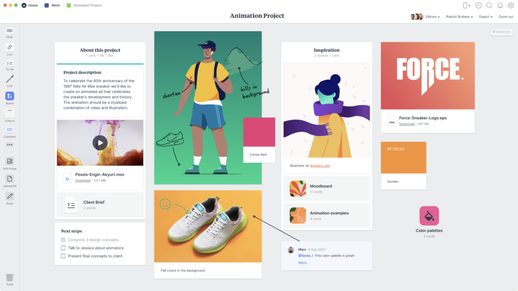
Milanote can be used as a web app, android/IOS app, or a desktop version for macOS and Windows. There is also a Web Clipper Chrome Extension and a Safari version that you can install, which can clip website links and add them to any board you like, the links will be placed into an unsorted column until you place them by yourself.
When you open Milanote for the first time, it won’t look like a note-taking app, and that is because Milanote takes an unusual approach, unlike the regular note-taking systems.
Upon first glance, you will be provided with a blank “Main” board, which can either be filled with assets, like notes, links, comments, arrows, and more, or nest another board within the first, essentially like adding another separate board. You can navigate the boards using a breadcrumb trail at the top, kind of like navigating through folders on your computer.
Milanote Features
Using Milanote’s range of assets, you can create some pretty complex notes using the diagramming features. You can also embed images, text boxes, checkboxes, comments, PDFs, and lists into your board, you can also keep assets in the unsorted column on the right-hand side until you figure out where you plan on adding them.
Milanote’s Collaboration features should also be mentioned here, as they are very usable, and not just a gimmick. Using the drawing feature, you can essentially use it as a whiteboard for your team. When someone who has editing privileges starts changing any of the assets, it will be highlighted and have their initials, so you know who is doing the changes,
Boards are also shareable, either using links, which can provide users with editing permissions, or read-only permissions. You can also export them as a PDF, PNG, or convert the board into a vertical document and export that as a word document, markdown, or just plain text.
Milanote Mobile App

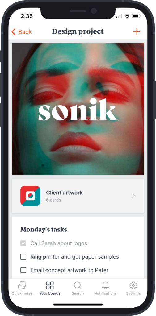
The Milanote Mobile app is also very useful, you can use it to capture quick notes, then add them to boards later, kind of like Evernote and view your existing boards, but when you view them, you don’t have many viewing options, as the board gets shuffled into a vertical scrolling board, not what you had initially planned on your desktop.
Milanote Templates
When you create a new board, you will be asked if you want to use a pre-existing template built by the Milanote team, there are templates for:
- Agencies
- Graphic Designers
- Illustration
- Interior design
- Marketing
- Brainstorming
- And more!
There are over 30 templates made by their team, and templates are one of my favorite notion features, but surprisingly, Milanote doesn’t have a way to make user-made templates, which is disappointing.
Milanote Cons
Like any app, Milanote has drawbacks, some features which should be in any app are missing, like, integration with other productivity apps like ClickUp, Asana, monday.com, other To-Do apps like ToDoist, any.do, or maybe embedding miro boards or Google calendars.
Another huge drawback is the lack of templates, and not being able to create templates, as well as creating templates to reuse in other boards.
Tagging boards could also be very useful, maybe even tagging specific notes with tags to differentiate between work and personal notes.
Mailnote is still a new service, and it’s not as fleshed out or has a big team behind it as Microsoft OneNote or EverNote. But they are slowly growing, and have a bright roadmap ahead.
Mailnote Pricing
Milanote has 2 personal plans, Free, which gives you unlimited boards, but you can only use 100 assets, which will run out quickly unless you delete everything in a board when you are done with it, or Pro which is $9.99/month and it gives you access to everything.
Milanote’s Team plan costs $49/month for up to 10 people or $99/month for up to 50 members of your team.
Is Milanote Worth It?
Milanote adds a new spin onto the regular note-taking system, and its diagramming features should be more than enough for diagramming, but less complicated than other options like Miro. Milanote is more complex than EverNote but less complex than Notion.
Milanote’s approach to quick notes is also one of the reasons to consider it, as you can organize your quick notes in such a way that has never been done before, and organizing notes is something I rarely do.


