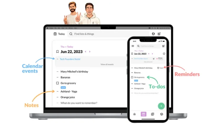
Caffeine is Reader Supported, If you do buy through links on our website, we may earn a commission at no extra cost to you. Read the full disclaimer here
A unique problem of our increasingly digital world today is the ability to maintain productivity while effectively managing time. The go-to solution for this common dilemma involves using calendars to track time, tasks, and events. It stands to reason that meticulously planning every minute of the day will result in more productivity.
On the other hand, we have productivity apps. Productivity apps help users achieve goals or meet deadlines by streamlining tasks, providing tools to manage time, and promoting focused work through distraction-minimizing features.
However, common issues include a lack of flexibility, confusing user interfaces, and underutilizing the app’s features. Here is where Twos emerge to capture things, organize, and keep track of them with a simple, intuitive user interface.
Twos may appear to be another app on the ever-expanding productivity apps landscape, but it stands out for its user-centric design, simplicity, and functionalities. While most productivity apps offer users many exciting features, Twos takes the minimalistic route, offering an intuitive tool for capturing ideas, managing tasks, and staying organized.
TL;DR
Twos brings a refreshing approach to the productivity tool market. It prioritizes ease of use and simplicity in capturing things – tasks, notes, and ideas – by utilizing a clear list-based organizing system to boost focus. You can bookmark, publish, and roll over tasks. Twos’ collaborating and sharing also empowers users to brainstorm in real-time with teammates
Fortunately, in addition to its core focus on simplicity, Twos features list creation, organization, and collaboration, allowing you to share your lists and work with others. This unexpected blend of features typically absent from minimalist productivity tools makes Twos a refreshing option for those seeking an uncluttered yet versatile tool for focus.
If you require a productivity app that is intuitive, quick, and user-friendly, Twos is worth a try. It is a tool for those who value a streamlined approach to capturing and organizing things.
Getting Started with Twos
One of the first things you will notice about Twos is that it breaks loose from the limitations of being available on select platforms. It functions seamlessly across Android, iOS, Chrome Extension, macOS (Intel, M1 + M2), Windows, and Linux allowing you to capture ideas, manage tasks, and stay organized on a phone, tablet, or computer. Whether on mobile or desktop, Twos readily adapts to your workflow.
Since I mostly use note-taking apps on my phone, I decided to use Twos primarily on my phone, including the onboarding and all of the testing, though I did also use it on other platforms and included the results below.
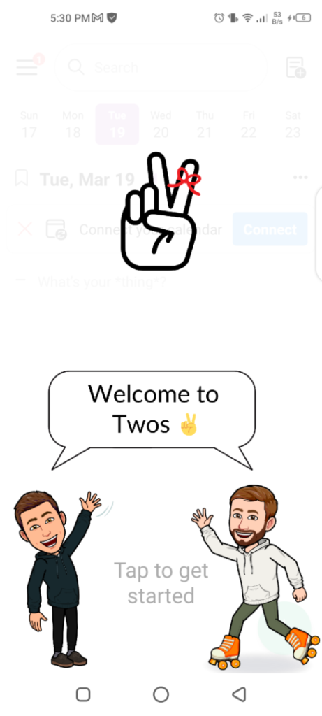
Regardless of your chosen platform, getting started with Twos is a breeze as all platforms offer a streamlined onboarding experience. An uncluttered yet interesting user interface is your first interaction with this tool, without overwhelming tutorials or flashy animations.
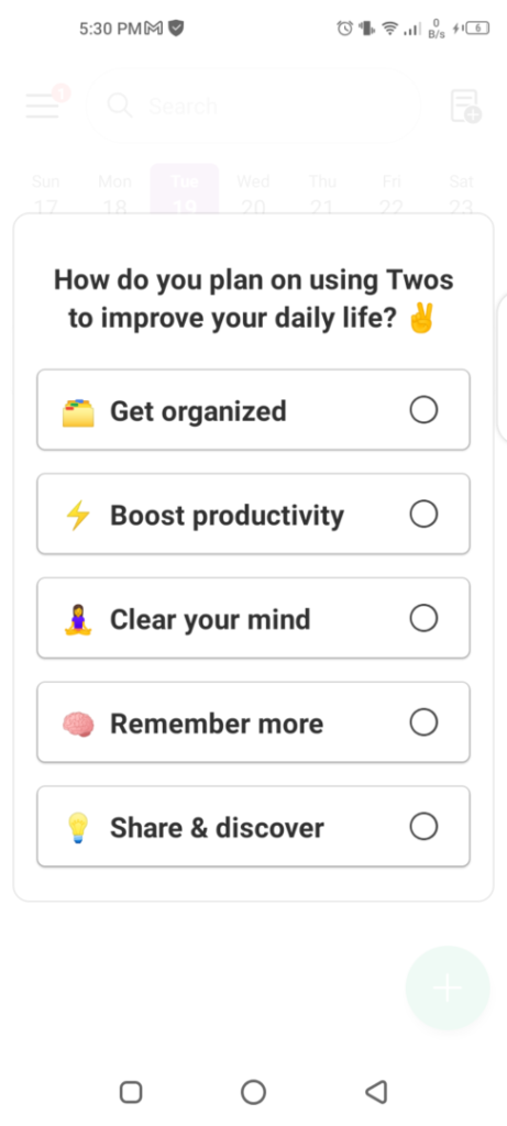
The onboarding begins with a screen where you encounter a question asking how you want to use Twos. You can only select one. After this, you go through a clear and concise introduction to the app. This will be your first interaction with the concept of “things” according to Twos.
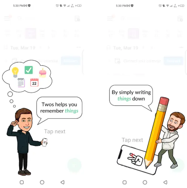
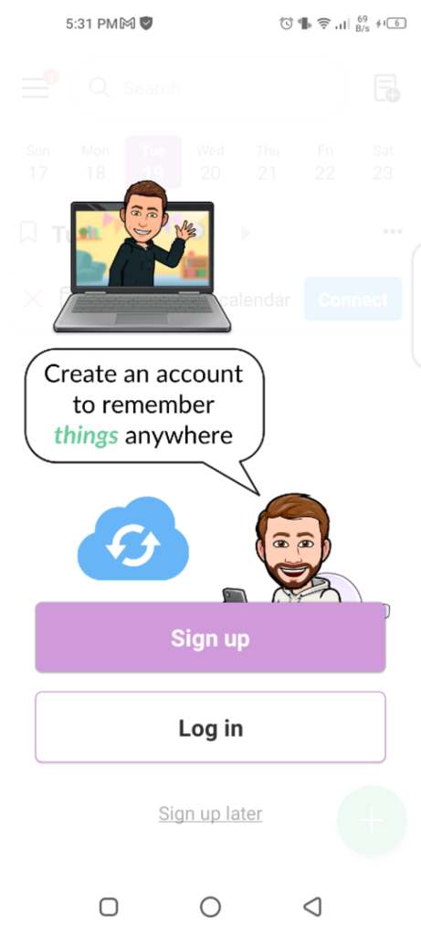
Next, you encounter the account creation screen where you can choose to sign up later. Twos allows you to test the waters before committing. However, signing up for a free Twos account unlocks features like syncing your information across devices and collaborating on shared lists with others.
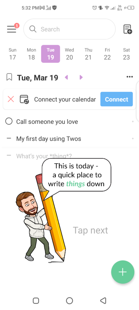
Staying true to its simple and user-centric approach to productivity, its home screen prioritizes intuitiveness and clarity. A quick click-through tutorial shows you where and what the features seen are. Finally, the concept of “things” is explained.
The Home Screen Interface
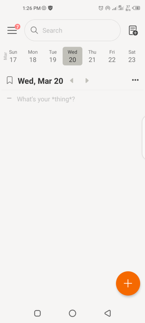
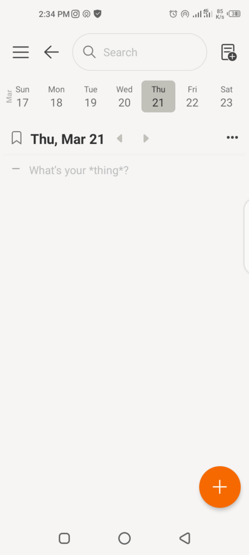
The Twos home screen possesses a layout that promotes organization. The central element for the day is the prominent “What is your *thing*?” input field that invites you to create notes, reminders, to-dos, and more. This position captures ideas and tasks as the most important user action.
To the topmost left of the home screen lies the navigation menu. With a click, you have features like calendars, to-dos, reminders, bookmarks, and more displayed. To the right, lies your lists.
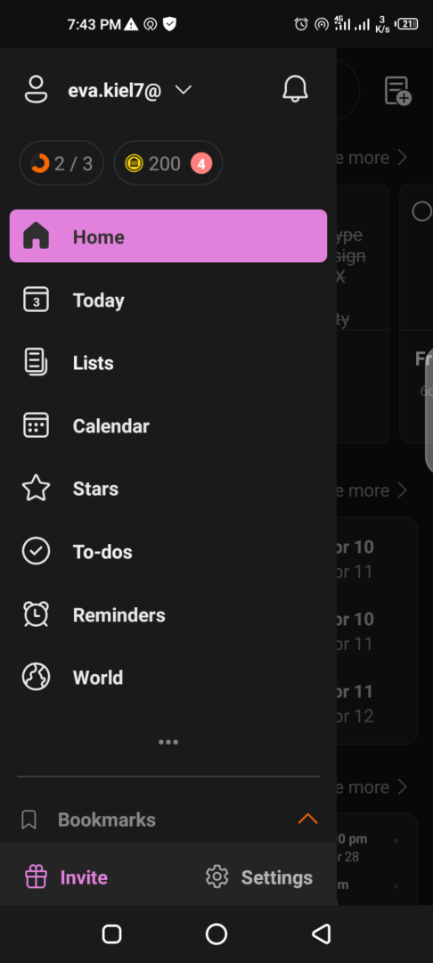
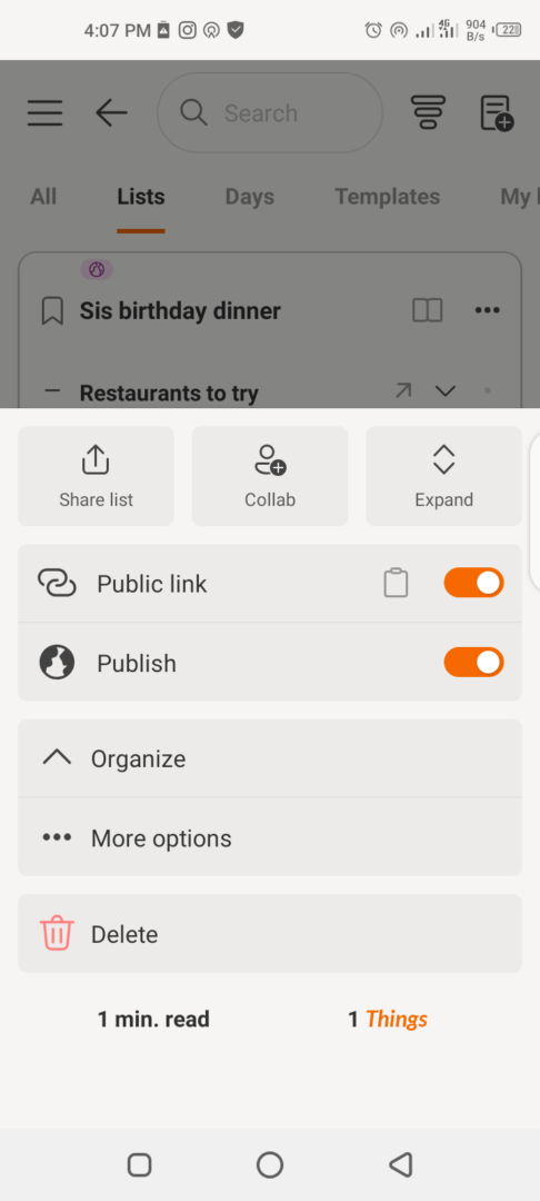
Each list is displayed on a clean sticky card, whether user-created or automatically generated daily lists. The sticky card design promotes scannability, allowing users to identify and access relevant information.
Lastly, is the “+” button. Its placement at the bottom corner of the screen reinforces the focus with a natural user flow on capturing ideas and organizing them into lists. This is an accessible feature that reduces cognitive load while improving productivity with a simple tap, not the navigation of a complex app.
Twos: Boost Your Productivity with Powerful Features
Aside from its simple and user-centric design, Twos offers a surprisingly robust and functional feature set for a minimalist app. How do Twos empower users to brainstorm ideas, create to-dos, manage tasks, and stay organized, resulting in boosted productivity? Let’s explore some of its features, categorizing them into core functionalities and unique features.
Core Features
Today
Upon opening Twos, you immediately interact with the home screen, which doubles as the Today view. The screen displays the day and date, and immediately below is the “What’s your *thing*?” field which invites you to capture your daily tasks and thoughts.

Like all productivity tools, you can schedule to-dos, lists, or ideas days and months ahead. You can also set the lists to reset daily. Things from the previous day not completed roll over to the new day where you can complete them. You complete them by swiping right on the task, canceling them out, upon which you get a confetti shower. You can also swipe left to move a thing to the next day.
Lists
Twosapp positions Lists as the bedrock of organizing, allowing users to categorize things, streamline workflow, and boost productivity. Creating lists on Twos is a simple process. From any page on the app, you can tap on the “+” icon on the upper right corner of your screen and assign a name.
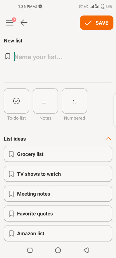
You can categorize your thing type as you capture it, ensuring it fits into the most relevant category. That can be a to-do, note, sub-list, and more. Visual hierarchy reigns as you view your lists as clean sticky cards. So with a glance, you can scan and identify crucial information without scrolling through endless text.

You can also rearrange your lists according to priorities with a tap-and-hold, drag-and-drop function. More options include sharing, copy lists, reset daily, and auto-sort.
Twos’ lists feature shows an intentional user-centered design that promotes focus by grouping tasks and giving a clear view of your workflow at a glance with its categorized lists.
To-dos
There are several ways to create a to-do on Twos. You can navigate to the to-do screen through the side navigation bar. Or, by selecting the to-do lists card after clicking on the lists icon. You can change a thing type by pressing and holding until options appear. Also, upload images relevant to your to-do and set a reminder to notify you when it’s time for execution.
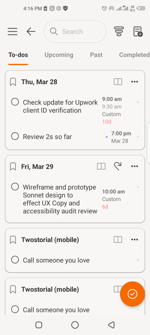
As a task management feature, the to-do function excels in its simplicity in capturing information. You can set a starting and ending time for each task and even set them as events. A progress circle enables you to track your progress through tasks. If you cannot complete a to-do for the day, Twos automatically rolls over to the next day.
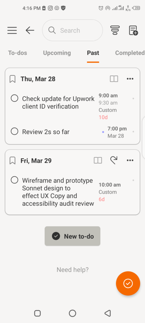
You can manage upcoming, past, completed, canceled, or hidden to-do lists from the navigation bar.
Calendar
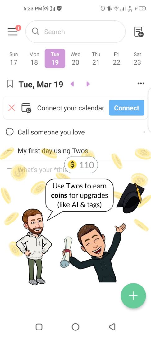
The first time you use Twos, you will notice a tip to connect the app to your device’s calendar. This allows your lists, reminders, events, and others to sync. You will also receive notifications of upcoming tasks from your device and the app.
Unique Features
Share and Collaborate
Productivity thrives on collaboration, especially when working together towards a shared goal. Twos understands this as seen by a share and collaborate feature on an otherwise simple and minimalist app. These features empower users to collaborate seamlessly with others on a shared list.

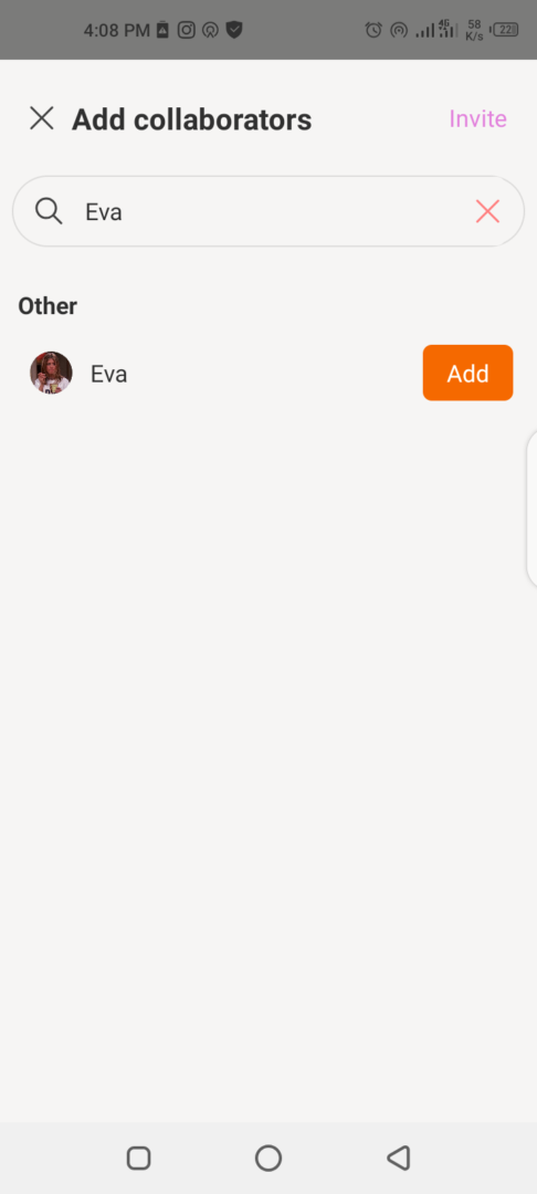
Typically, a collaboration feature where users can invite others to view and work together is often present on apps with more complex offerings. This makes Twos exceptional when we consider its simple approach to productivity.
Twosers
There is a community of people who use Twosapp. This feature allows you to follow other users or to invite people to discover Twos. You can follow others, or be followed. In an interesting twist, there is also a block function. You can draw your conclusion.

Integrations
Although Twos is a tool that offers a simple and efficient way to brainstorm, capture ideas, and organize tasks, its means of integration with other productivity tools is limited. The areas where you can integrate functionalities to Twos with existing workflow include calendars, widgets, email, text, and WhatsApp.
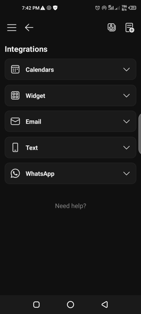
That’s quite a small offering, however, it stays true to the minimalist approach of the app.
FAQs and Help
Even simple apps can be confusing to a non-tech-savvy person. A measure of the user-first design of a digital product is how easily users can receive help when they encounter issues, no matter how small.
Apart from its intuitive and simple user interface, Twos shows how much it values a smooth user experience through the presence of a robust help feature. If you have questions, and cannot find answers in the detailed FAQs section, you can contact them via direct mail.
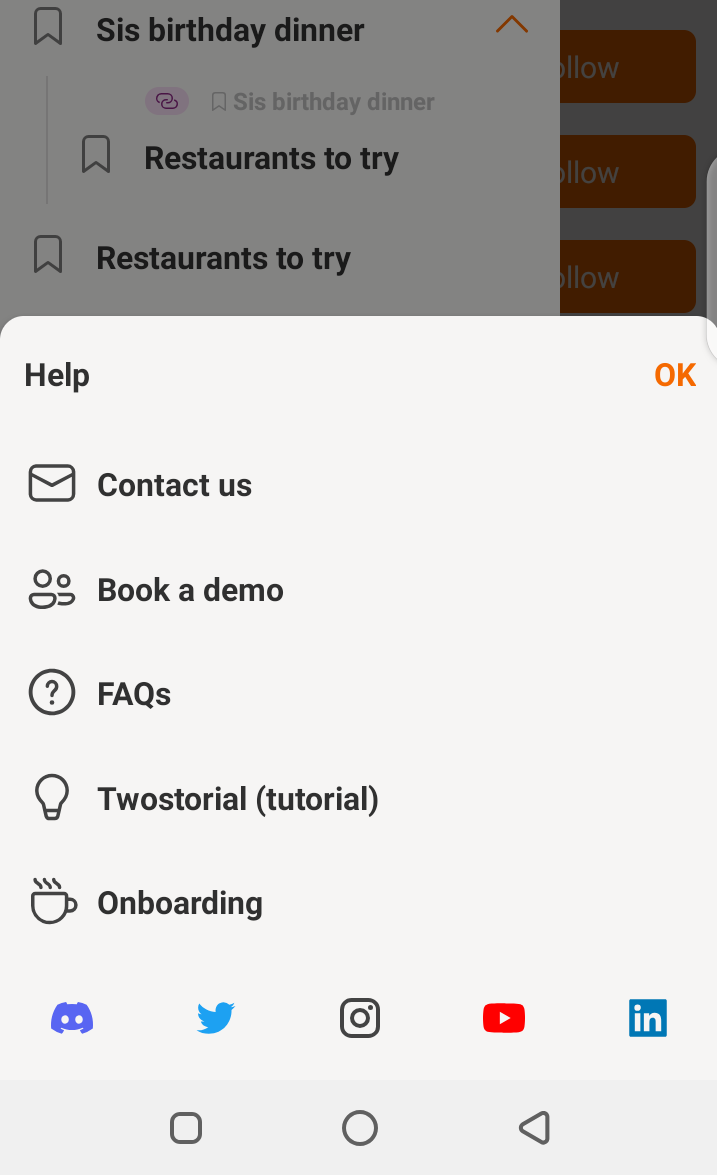
Did you forget what functions give what results? The Twostorial (tutorial) is there to walk you through at any time. Did you miss the onboarding? You can experience it again by clicking on the onboarding option in the help section.
Who is Twos Tailored For?
Twos is an app tailored for users who prioritize simplicity and organization. Do you:
- Love a clean and clutter-free interface?
- Capture information via lists to boost focus and clarity in your workflow.
- Brainstorm and capture thoughts and ideas on the go.
- Need a simple tool to share and collaborate on not-so-complex things with others?
Twos may be the perfect productivity tool if you can relate to one or more of the above.
Twos Cons: The simplicity Trade-Off
As with everything, no one thing, or in this case, an app, can satisfy the needs of every user. Although Twos offers a streamlined and user-centric approach to boosting productivity, there are limitations too. These include:
- Limited integration
- Lack of a highly personalized workspace
- Lack of crucial elements for more complex project management
The demographic that will find the above limiting include:
- Power users
- Project managers
Considering the emphasis of Twos on ease of use, a trade-off had to occur for the simplicity its users enjoy.
Worthy Mention: Twos’ UX Copy
A worthy mention goes to the UX copy of Twos as it plays a vital role in achieving a user-centric and simple approach to productivity. Aside from being clear and concise, I observed the consistency through the app in the voice and tone. From the onboarding to the settings, we experience microcopy designed with intent. The tone of voice detected in the app’s UX copy guides users in a simple, supportive, and action-oriented manner.
The Review
Twos
If you want speed and a clutter-free productivity tool, Twos might be your new buddy. However, it might not be ideal for you if you are a power user requiring advanced functionalities and integrations for complex workflows.
PROS
- Simple UI
- Quick capture of ideas & tasks
- List-based organization
- Share & collaborate in real-time
CONS
- Offline availability
- Limited features
- Limited integrations
- Not ideal for complex workflows
Review Breakdown
-
Integrations
-
Formatting
-
Personalization


